I'm still in shock! I ordered my border fabric for Quilty Fun, all the way From Florida and it was here within 36 hours, beating the projected Tuesday delivery time by a landslide! Now would someone please explain to me how it is possible that it once took 10 days for an insurance payment to get from our little home post office to our insurance agent 12 miles away? Did it go door to door?!?!?!?! Ahhh, sweet mysteries of life!
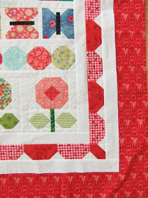
So, when last we met...I shared this picture and told you I had selected a border print from within the the quilt, and I Double Dawg Dared Ya' to see if you could guess what it might be.
I did a Few of bits of auditioning, First of all, even though 1960's appliance aqua is just about my least Favorite color ever, I tried a little aqua that I had purchased when I was pulling together prints for my youngest daughters Butterfly quilt, after all, the original Quilty Fun quilt does have a wide border of pale aqua.
This was a brighter, more palatable to me aqua.
Nope, still not liking it. Too bright, too overpowering.
The there were the adorable red mason jars...
Super cute...love it....
Wait! Where did the rest of the quilt go?!?!? All I see now are borders!
So No...Bright Aqua and Cute Jars...I'm sorry, you have been voted off the island.
Please take a moment to say your goodbyes...extinguish your torch or whatever it is you do here on Overly Active Imagination Island!
I also went to Mrs. Bumble and pulled out her black stripes thinking the way to control chaos might be basic black. So good job Helen...you did suggest black...
unfortunately, it's just that, it too, was already out of the running.
A little of the black, contained within Mrs. Bumble's plump body looked really cute, but a large Field of this super cute chalkboard print looked Faded out, Chalky and HEAVY against all the other crisper brights and softer pastels.
I've put it away for another day, when it will find its place to sing.
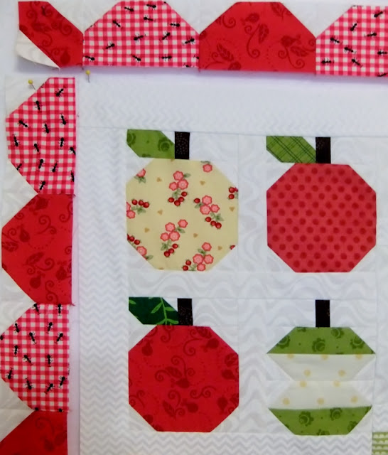
And then there was Quilt Sue whose Fresh eye made me look twice at something I hadn't considered.
The Green Plaid.
Might work, but I used two, so I auditioned both,
however, there are only tidbits left of them and I wasn't in the mood to take another cyber shopping trip. I also felt that, in large amounts, they were sparring with the other oddball greens in this corner of the ring, particularly the green mitten!
That was the knock out punch, for sure!
So where, oh where, did I settle? After double checking one more time?
Well...
Did anyone notice that the font color in my last post was
BLUE?
I decided, rather quickly, on a dusky evening with tired eyes, that it would be this adorable Lakehouse Pam Kitty print. Still, I did a double check of all these prints this morning...and For me, it still works, both in a larger field and close up.
It plays well with pretty much all of the interior prints I see here. It contains, blue, pink, red, white, yellow and more than one shade of green. It contains the quilt but still encourages my eye to move all around, taking in the entire composition.
It also conveys the overall feeling I aspired to as I selected prints to go into this quilt...with a couple of unexpected quirky ones thrown in.
It's happy, it's sweet, it's sentimental.
Also, Not To Be Missed!
If you look closely, you'll see that Mrs. Bumble now has antennae and an important message for you...
Bee Happy!
Happy Sunday!
~Nancie Anne
"Oh My Goonnuss!" as Shirley Temple said to Arthur Treacher, I just realized this is my 150th post! That is something to "Bee Happy" about, isn't it!


